
Project overview
A design task treated like a real activation problem.
The activation problem behind the brief was clear: customers completed onboarding and KYC, but did not consistently continue to fund their wallet or make a first investment. I went beyond the interface task to understand where uncertainty entered the journey and what evidence supported the pattern.
A mobile hub for the everyday investing journey.
ARM One brings account opening, wallet funding, mutual funds and securities, portfolio tracking, performance insights, purchases, and redemptions into one mobile experience for individual investors.
View the ARM One product pageWhy did the journey lose momentum after important actions?
Customers were completing KYC without progressing to wallet funding, while others funded their wallet without making a first investment. The audit examined the missing guidance, feedback, and reassurance between those activation steps.
Research approach
Looking beyond the original brief.
I combined a firsthand product walkthrough with publicly available app-store feedback. This was structured evaluative work and secondary qualitative evidence, not formal usability testing or user interviews.
- 01
App Store feedback
Reviewed public ratings and comments for recurring experience themes.
- 02
Google Play feedback
Compared a larger review set to see whether similar concerns appeared.
- 03
Firsthand walkthrough
Created an account, completed onboarding, funded the wallet, and explored investing.
- 04
Supporting analysis
Documented the audit, synthesised findings, and mapped a proposed guided flow.
The reviews added context around onboarding delays, unclear status updates, navigation changes, and concerns after funding. They reinforced observed patterns, but did not prove the cause or frequency of every issue.
The current journey
Two moments where guidance became unclear.
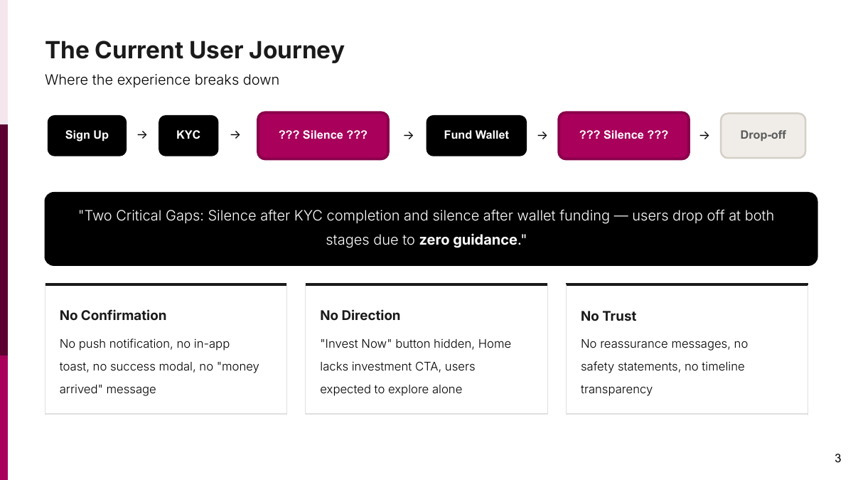
The journey had two activation breaks: customers who completed KYC did not consistently continue to fund their wallet, and customers who funded did not consistently proceed to a first investment. The interface did not clearly connect one completed action to the next.
- Sign upUser action
- Complete KYCUser action
- Feedback gapWhat happens now?
- Fund walletUser action
- Feedback gapDid my money arrive?
- Search for investmentIncreased abandonment risk
The experience became quiet at the moments where reassurance mattered most.
Audit findings
The problems extended beyond one missing button.
I grouped the evidence into four connected insights. Trust was the cross-cutting consequence: unclear states, missing feedback, and difficult navigation can make sensitive financial actions feel less dependable.
Lack of clarity
What am I supposed to do now?
Premature validation and unclear KYC states made it harder to understand what was happening.
Explain the state, the required action, and what happens next.Lack of direction
I funded my wallet. Now what?
Investment entry points were scattered, while the home state continued to prioritise adding cash.
Adapt the primary action to the user's current state.Lack of feedback
Did my transfer go through?
KYC and wallet funding did not create strong confirmation moments or visible next steps.
Confirm every important action and connect it to the next one.Lack of accessibility
Can I comfortably read and understand this?
Low-contrast text, status treatments, and difficult terminology reduced readability and confidence.
Improve contrast, hierarchy, and plain-language explanations.Firsthand evidence
Selected screenshots from the product walkthrough.
Only screens without personal account details are included here.
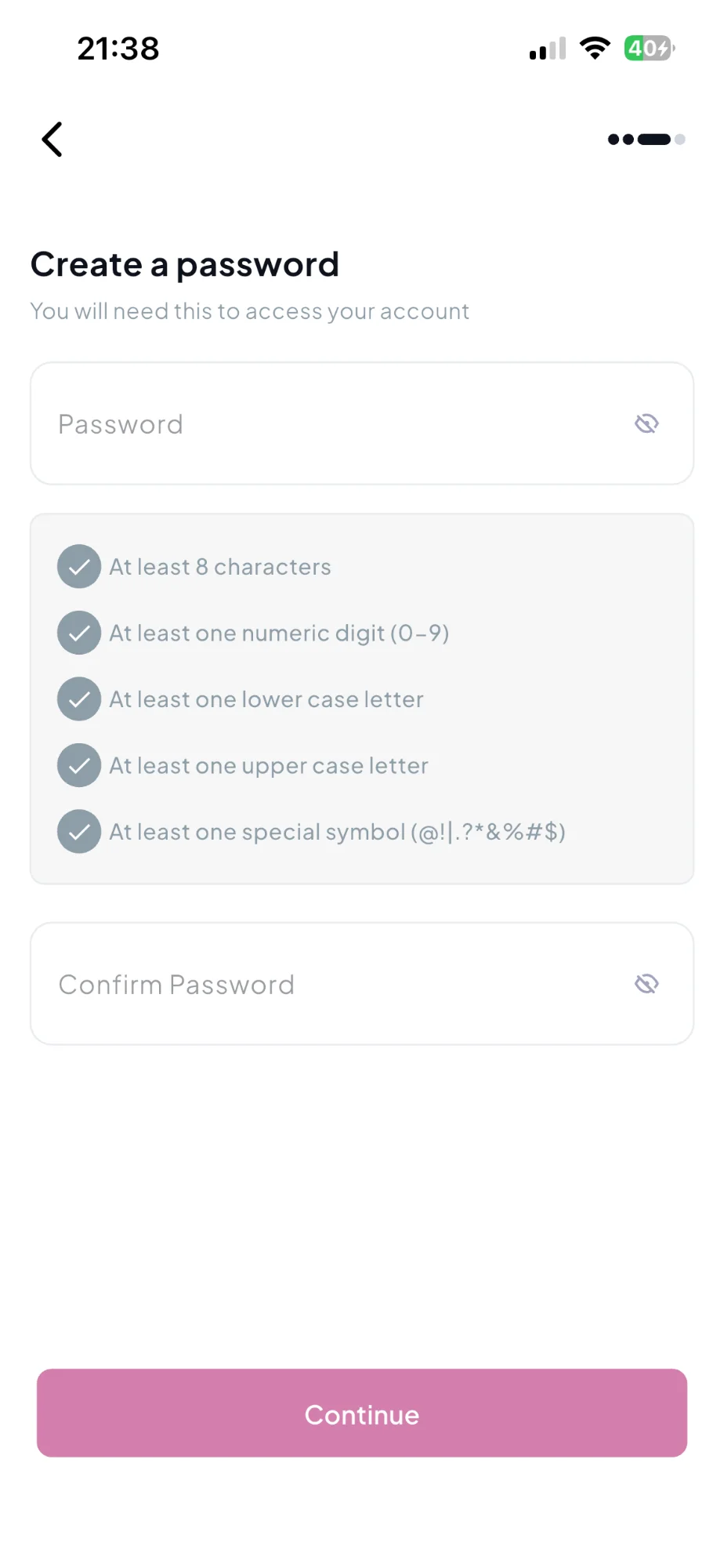
Password requirements were difficult to distinguish at a glance.
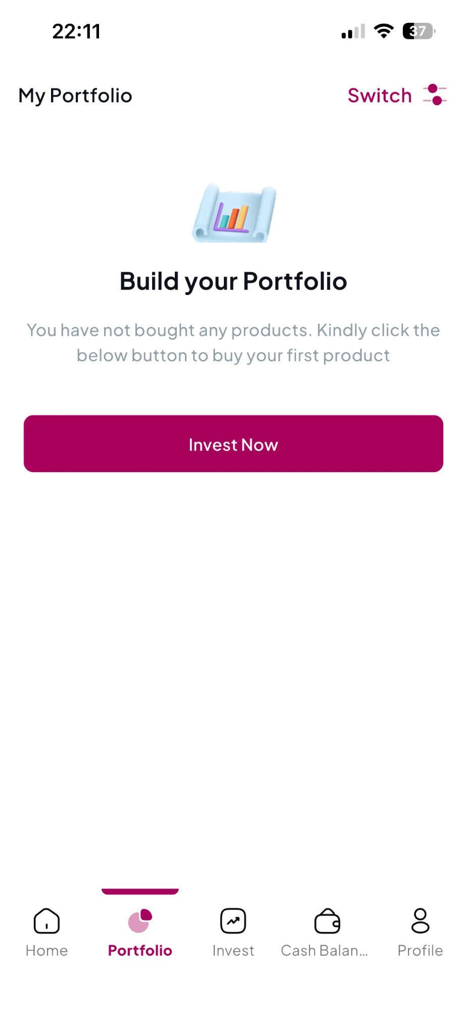
The action existed, but required users to find the portfolio state after funding.
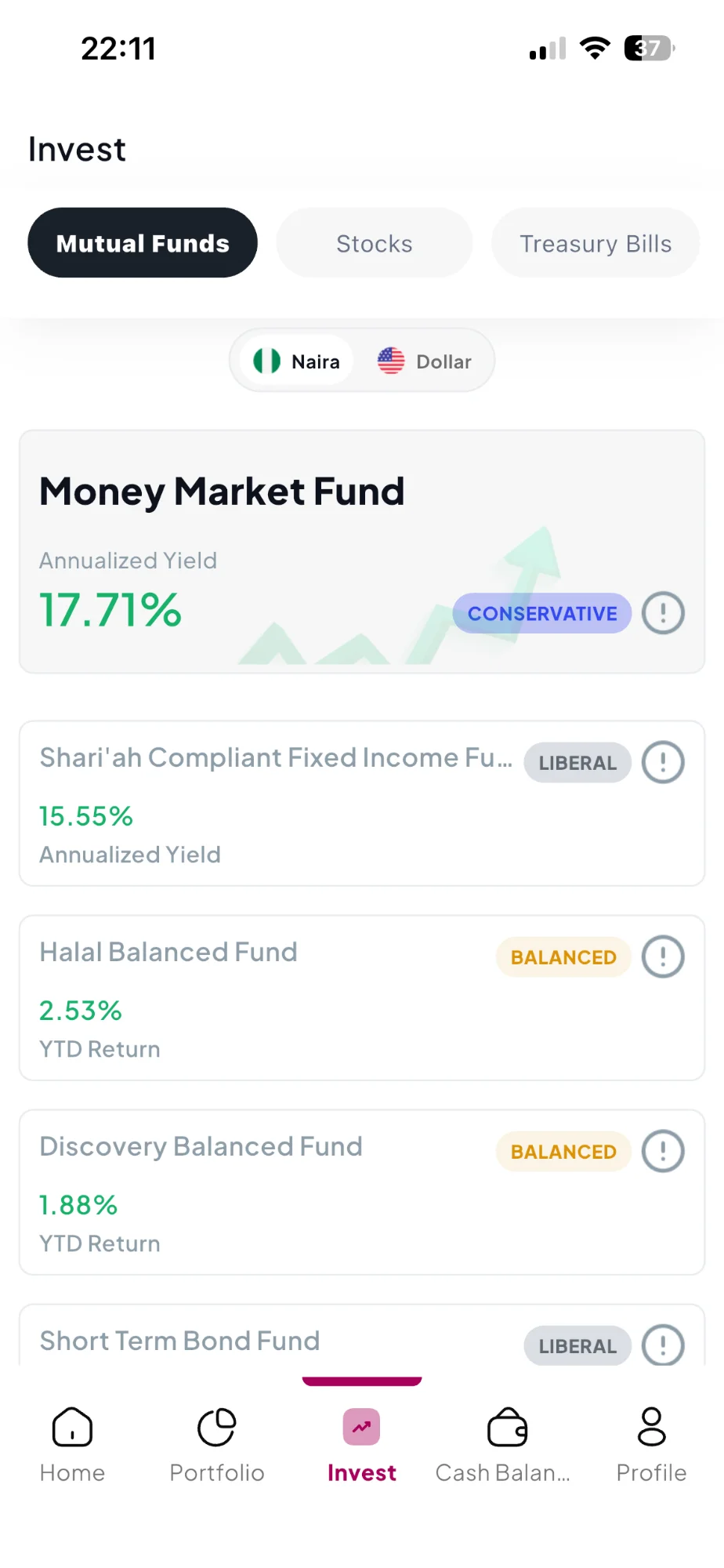
Risk labels could be unclear to someone investing for the first time.
Public review evidence
Feedback echoed several audit themes.
Limited status feedback
Users described uncertainty after submitting documents or funding their wallet.
Onboarding friction
Reviews mentioned long verification journeys with little progress information.
Navigation confusion
Some users struggled to relocate features after navigation changes.
Trust erosion
Repeated uncertainty around money and account status weakened confidence.
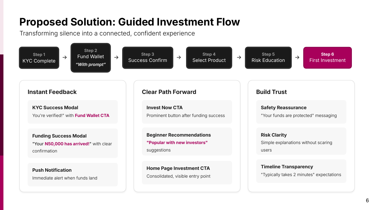
Proposed guided flow
From verification to a first investment.
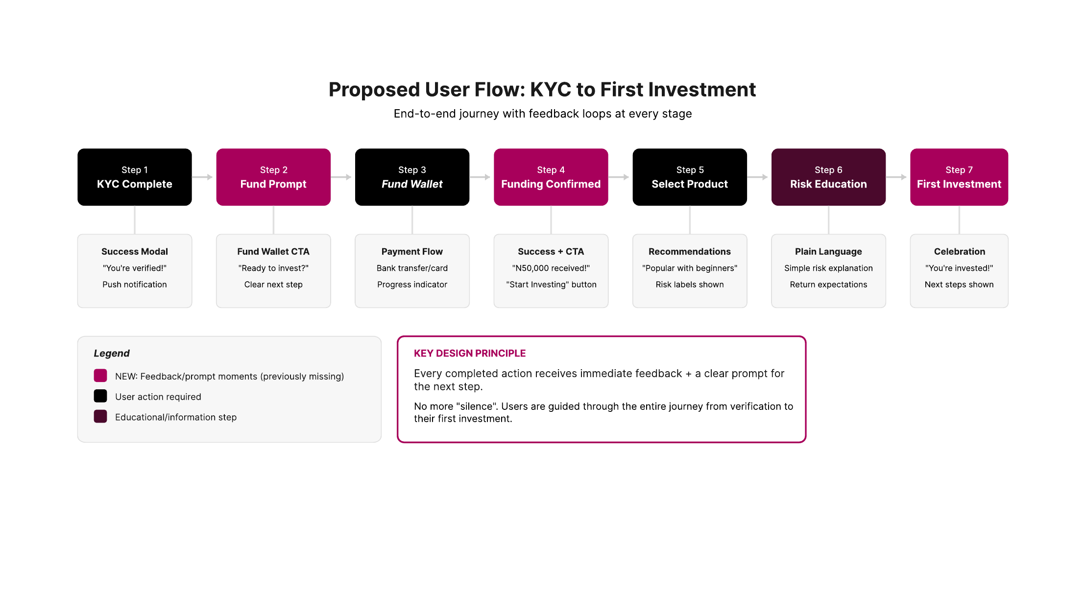
The proposal connected existing actions with missing feedback, reassurance, and next-step guidance. It was designed for evaluation and is not presented as an implemented ARM One journey.
Every completed action should receive immediate feedback and a clear prompt for the next step.
- 01KYC completeConfirm verification
- 02Funding promptShow the next action
- 03Fund walletComplete payment
- 04Funding confirmedConfirm receipt
- 05Select productOffer guided choices
- 06Risk educationExplain in plain language
- 07First investmentConfirm and explain next steps
Verified
Confirm that KYC is complete and present wallet funding as the next action.
Proposed conceptFunded
Confirm receipt, update the balance visibly, and make investing the primary next step.
Proposed conceptInvested
Confirm the investment and show where the user can monitor it afterward.
Proposed conceptDesigning for trust
Trust comes from product behaviour, not reassurance alone.
The product should explain what happened, what is still processing, what the user can do next, and where to find more detail.
- Is my account ready?
- Show verification status and the next required action.
- Did my money arrive?
- Confirm funding and make the updated balance visible.
- Which product should I choose?
- Introduce beginner-friendly guidance without making a recommendation claim.
- What does this risk mean?
- Use plain language with additional detail available on demand.
- What happens next?
- Close every important action with a clear next step.
- Can I trust this process?
- Use accurate status, transparent expectations, and verifiable information.
Proposed validation plan
The recommendations still needed testing.
The next step would be to test the guided journey with new or less experienced investors, then evaluate its effect if the work moved into implementation. The measures below are recommendations, not achieved results.
Funding to first investment conversion
Measures whether the journey supports activation.
Time to first investment
Shows whether guidance reduces journey friction.
Drop-off after funding
Tests the feedback-gap hypothesis.
Investment CTA engagement
Tests whether the next action is easier to find.
Support requests about confusion
Indicates where clarity may still be missing.
App-store sentiment
Tracks broader trust and usability perception over time.
- 01
Prototype testing
Test the proposed journey with new or less experienced investors.
- 02
Controlled comparison
Compare the existing funding handoff with the proposed confirmation and next-step treatment.
- 03
Post-launch monitoring
If implemented, review funnel behaviour and qualitative feedback regularly.
No usability study, A/B test, launch, conversion improvement, or app-rating improvement is presented as completed work.
07 · Outcome and reflection
In fintech, guidance is part of the trust layer.
The outcome was a documented UX audit, a synthesis of public user feedback, a proposed guided journey, and concept directions for the most important transition points.
This project reinforced that product design goes beyond the visible interface. It requires understanding the journey, the user's emotional state, the business objective, and the small moments that build or weaken confidence.
- Firsthand product audit
- Public app-review analysis
- Proposed KYC-to-investment journey
- Measurement and testing recommendations
A financial product should never leave users alone at the moment they need confidence most.