
01 · Project overview
Turning a promising engineering MVP into a product lenders could trust.
The lending and risk analytics platform helped financial institutions analyse bank statements, assess borrower health, and monitor portfolio risk. Its first version proved the technical idea, but the product experience was difficult to navigate and hard to onboard.
I led the redesign in close collaboration with product managers, engineers, data analysts, QA, sales, and users from lending institutions. The goal was to make sophisticated financial analysis feel structured, credible, and actionable.
02 · Problem context
Critical insights existed, but users struggled to reach them.
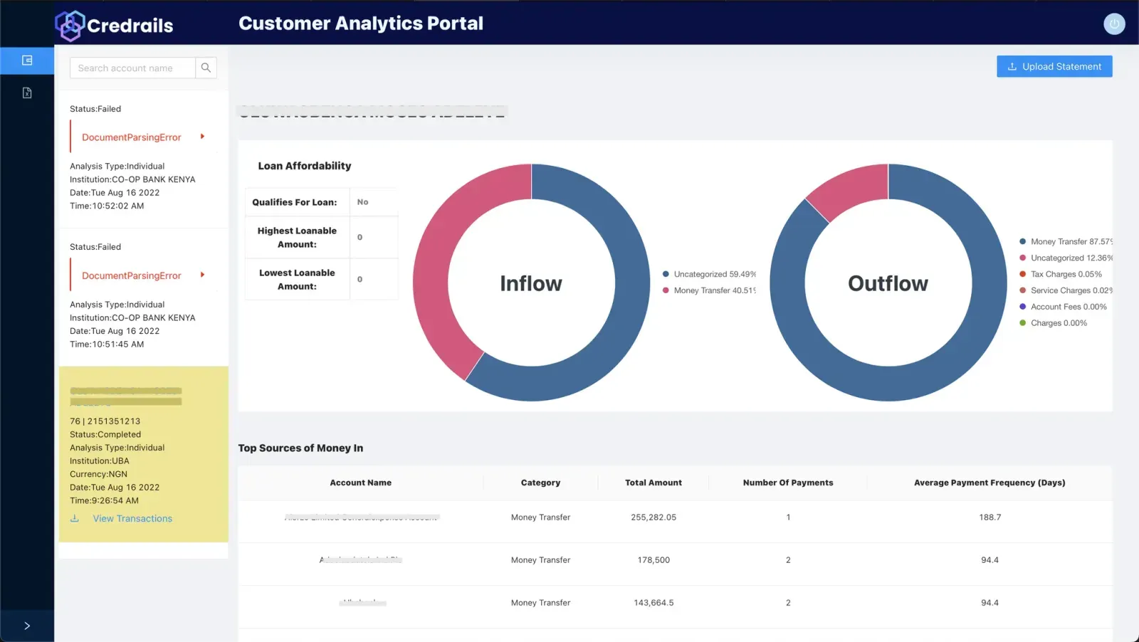
The MVP exposed many useful features without a clear hierarchy. Navigation was difficult, analysis parameters were rigid, and onboarding depended on slow manual support. These issues reduced trust and limited adoption.
Navigation
Important workflows and borrower insights were buried inside an unclear product structure.
Flexibility
A fixed analysis model could not reflect the different ways institutions assessed borrowers.
Onboarding
Manual registration and proof-of-concept setup created avoidable delays.
Trust
The interface did not communicate the precision expected from a financial decision tool.
03 · Goal
Help lenders move from raw financial data to a confident decision.
The redesign needed to support a wider range of lending institutions while making core journeys faster, clearer, and easier to learn.
Create a scalable analytics experience that gives lenders the right information at the right level of detail, without hiding the evidence behind a risk decision.
04 · Research and discovery
Combining user evidence, stakeholder context, and a product audit.
Discovery sessions aligned business goals with what the engineering team had already built. I then combined user interviews, surveys, and a UX audit to understand where the existing experience broke down.
Loan officers and decision-makers described spending too much time locating information, working around rigid parameters, and waiting for account setup. They wanted speed, but not at the expense of accuracy or control.
A competitive review showed that many products were powerful but difficult to customise. That created an opportunity to combine real-time analysis with a clearer interface and more flexible decision tools.
Speed with evidence
Users wanted faster decisions and an understandable trail back to the source data.
Flexible analysis
Different borrower profiles required adjustable parameters and clearer comparison.
Simpler setup
Institutions needed to register, onboard teams, and manage access with less support.
05 · Design process
Reframing the architecture before redesigning the interface.
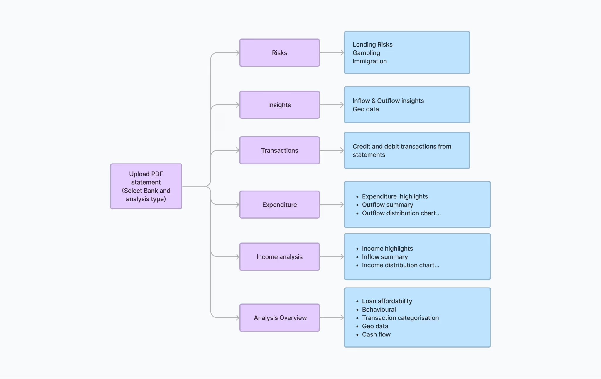
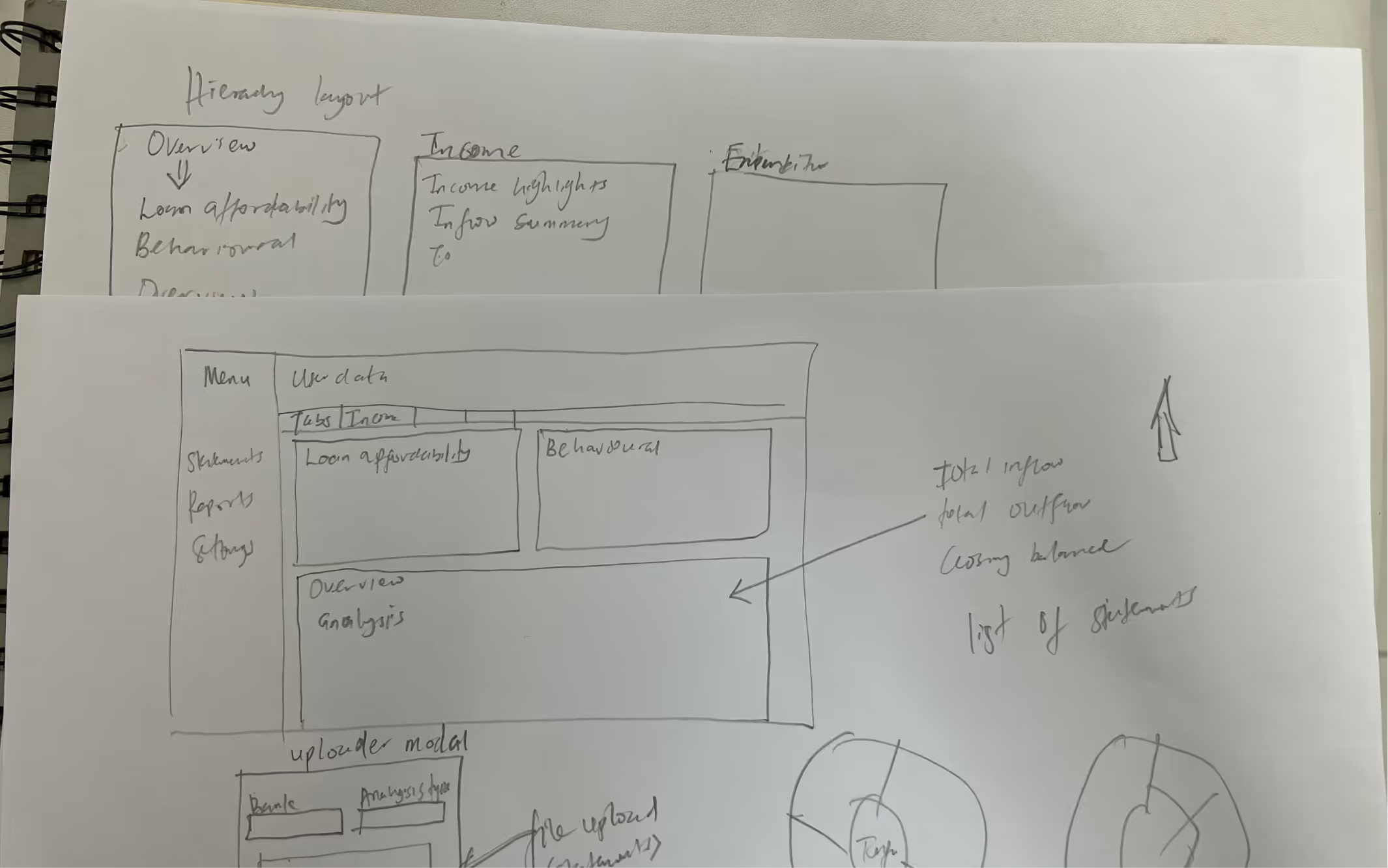
I reorganised the product around the decisions users needed to make, then explored flows through sketches and low-fidelity concepts. The architecture separated onboarding, statement management, analysis, reporting, and administration into clearer areas.
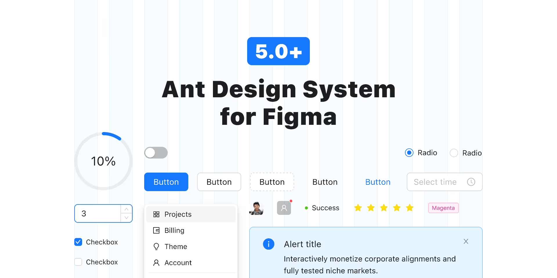
To meet a tight delivery timeline, we used Ant Design as a technical foundation and adapted its typography, spacing, colour, forms, tables, and interaction patterns. This balanced implementation speed with a more coherent product identity.
06 · Testing
Testing the decisions, not only the screens.
Participants from lending institutions completed navigation, onboarding, statement analysis, and role-management tasks. The sessions helped us see whether users could work independently and understand the hierarchy of financial insights.
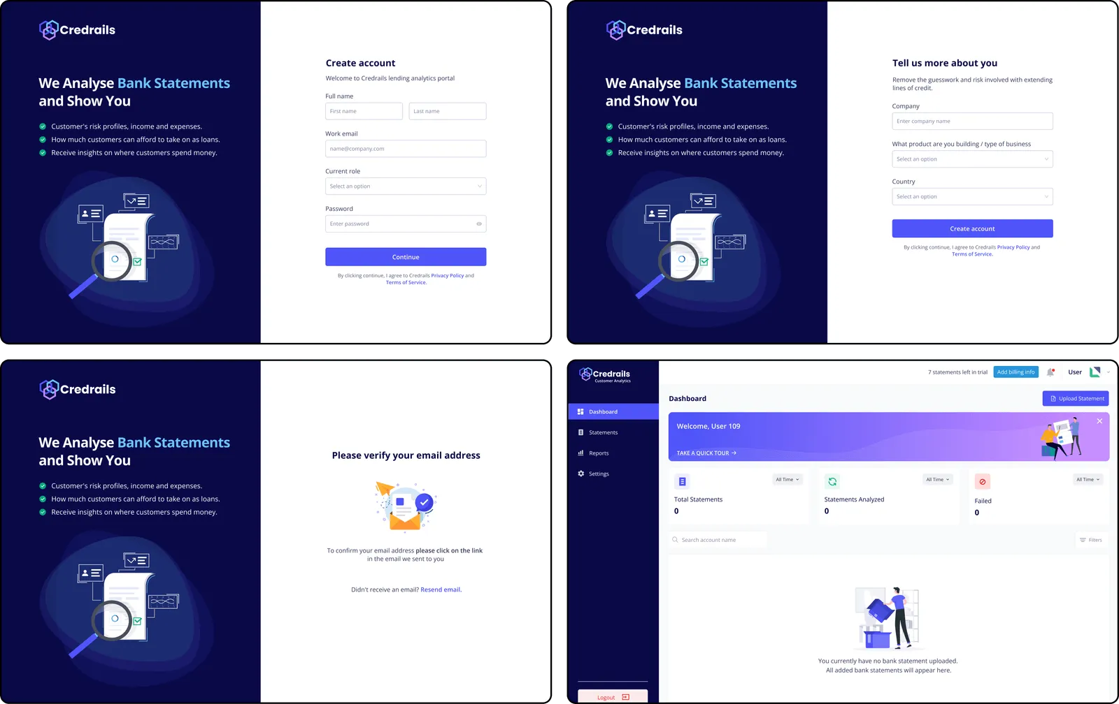
Early testing showed that sign-up was too long, offline reporting was missing, and fraudulent-statement indicators needed to be clearer. We shortened onboarding, introduced exportable analysis summaries, and strengthened risk indicators.
The developed product was tested again using the same critical workflows to confirm that the implemented experience matched the intent of the prototypes.
07 · Solution
A clearer path from onboarding to borrower analysis.
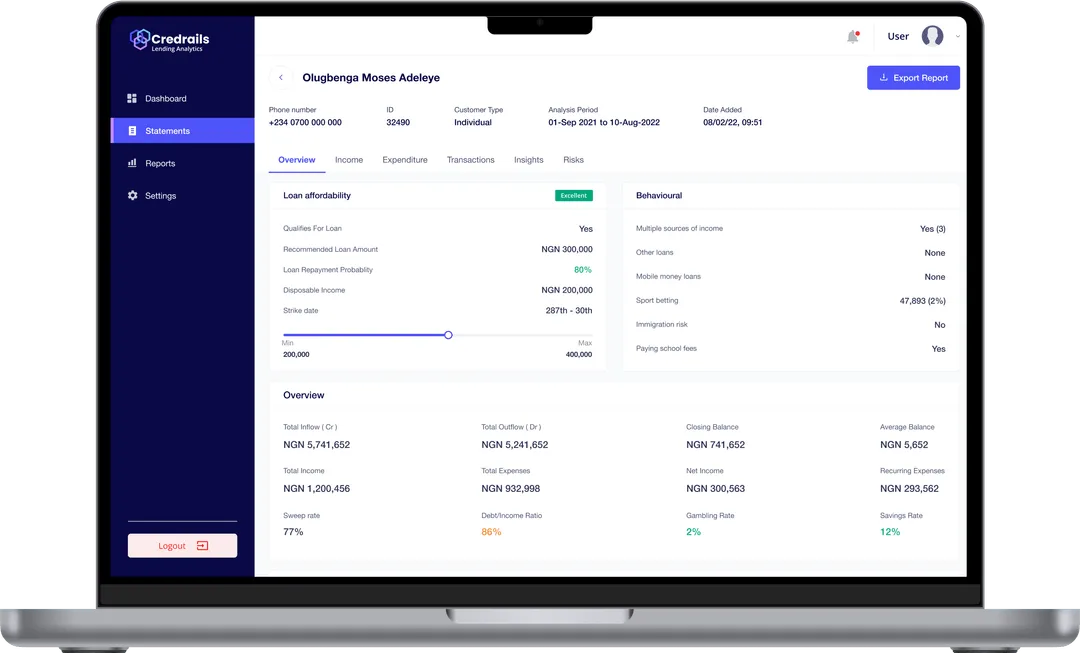
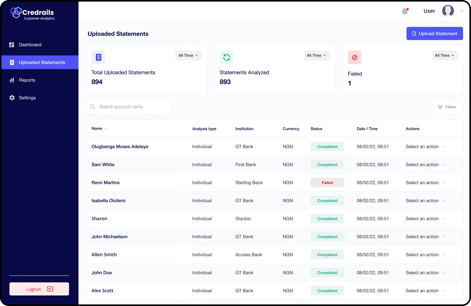
The redesigned experience automated company registration and introduced clearer account and role management. A central statement library made uploads, processing status, and reports easier to find.
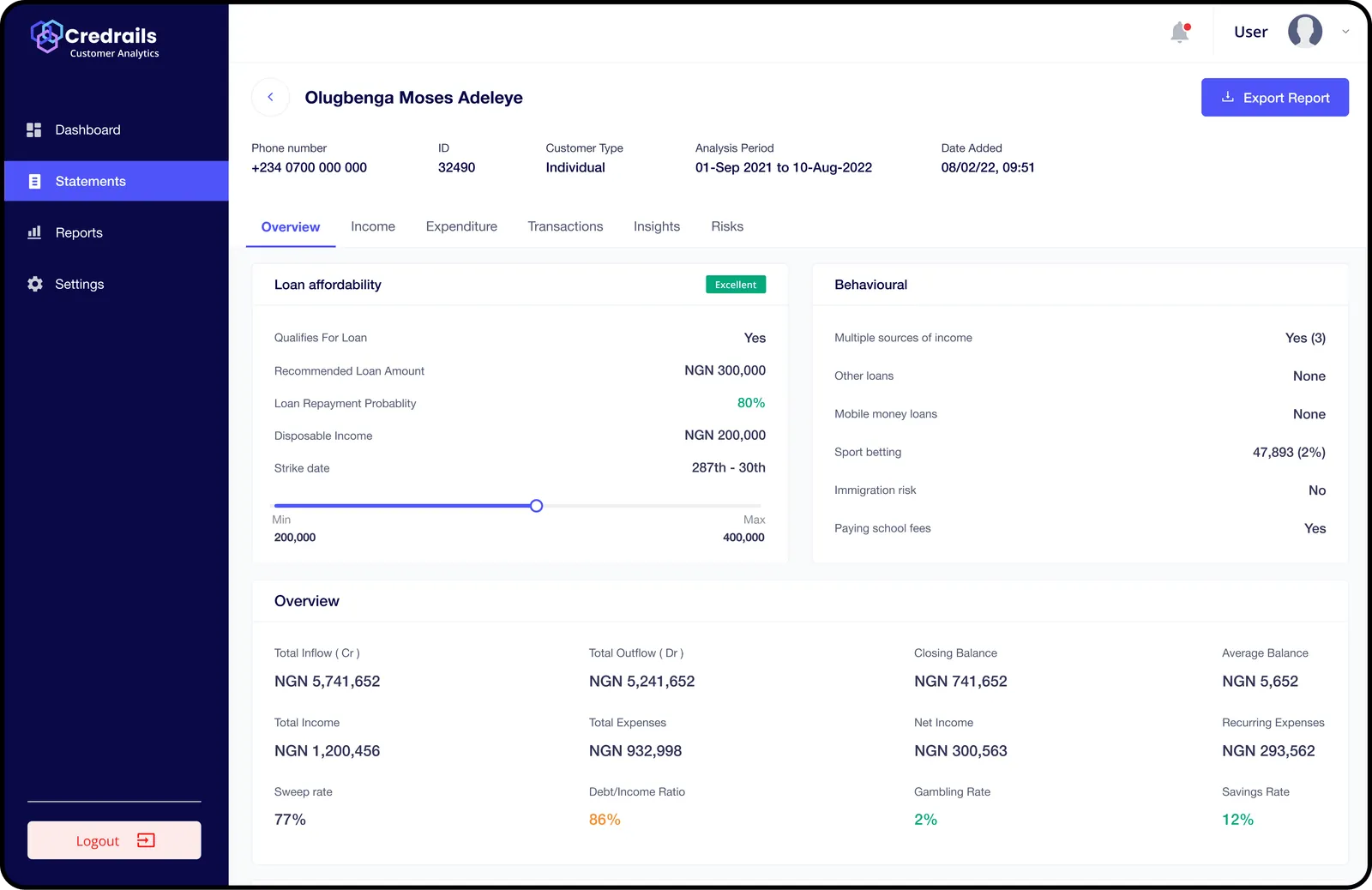
The analysis view grouped qualitative and quantitative insights into a structured hierarchy. Overview cards surfaced the most important signals, while tabs allowed users to inspect the evidence and deeper metrics behind a decision.
08 · Results and learning
A more scalable product and a more legible decision process.
Automated onboarding reduced setup friction, clearer navigation improved product adoption, and the redesigned upload and analysis flow helped institutions reach borrower insights more quickly. Role-based access also improved security and operational control.
The project reinforced that financial interfaces should reduce cognitive load without concealing complexity. The best outcome was not fewer data points, but a hierarchy that helped users understand what mattered first and where to investigate next.
Reflection
Financial clarity comes from hierarchy, not simplification alone.
The redesign showed me that reducing cognitive load does not mean removing the evidence behind a decision. Lending teams still needed depth, flexibility, and control. The product had to make the most important signals visible first while preserving a clear path into the underlying data.
That balance between immediate understanding and deeper investigation continues to shape how I approach complex financial and operational products.
The goal was not fewer data points. It was a clearer order for understanding them.